Free Template
Coming Sssoon Page
166.9K 256
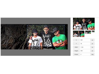
Image Crop jQuery
184.3K 62
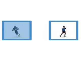
Image Checkbox
403.1K 73
masonry Image Gallery
- Now
thanks
Isaac Quansah| Web Designer | Website: bit.ly/isaac-amoah-quansah
Isaac Quansah () - 8 years ago - Reply 0