<link href="//netdna.bootstrapcdn.com/bootstrap/3.2.0/css/bootstrap.min.css" rel="stylesheet" id="bootstrap-css">
<script src="//netdna.bootstrapcdn.com/bootstrap/3.2.0/js/bootstrap.min.js"></script>
<script src="//code.jquery.com/jquery-1.11.1.min.js"></script>
<!------ Include the above in your HEAD tag ---------->
<div class="container">
<div class="row">
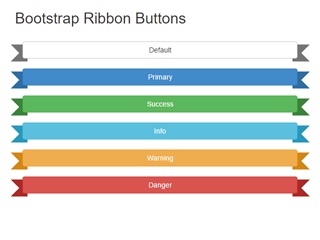
<h2>Create your snippet's HTML, CSS and Javascript in the editor tabs</h2><a href="#" class="button blue">
Find Out<br>More
</a>
<a href="#" class="button yellow">
Pre-Order<br>Now
</a>
</div>
</div>
.button {
text-decoration: none;
color: white;
padding: 10px;
text-transform: uppercase;
display: inline-block;
text-shadow: -2px 2px 0 rgba(0, 0, 0, 0.2);
font-weight: bold;
padding-right: 50px;
margin: 10px;
-moz-transition: all 0.1s linear;
-o-transition: all 0.1s linear;
-webkit-transition: all 0.1s linear;
transition: all 0.1s linear;
-moz-transform: translateZ(0);
-ms-transform: translateZ(0);
-webkit-transform: translateZ(0);
transform: translateZ(0);
/*
Kinda replicates keyline but looks dumb.
@include filter(
drop-shadow(0 1px 0 rgba(blue, 0.2))
drop-shadow(0 -1px 0 rgba(blue, 0.2))
);
*/
}
.button.blue {
background: -moz-linear-gradient(top, #a2d3e9, #7abedf);
background: -webkit-linear-gradient(top, #a2d3e9, #7abedf);
background: linear-gradient(to bottom, #a2d3e9, #7abedf);
box-shadow: -1px 0px 1px #6fadcb, 0px 1px 1px #54809d, -2px 1px 1px #6fadcb, -1px 2px 1px #54809d, -3px 2px 1px #6fadcb, -2px 3px 1px #54809d, -4px 3px 1px #6fadcb, -3px 4px 1px #54809d, -5px 4px 1px #6fadcb, -4px 5px 1px #54809d, -6px 5px 1px #6fadcb, -6px 7px 0 rgba(0, 0, 0, 0.05), -5px 8px 0 rgba(0, 0, 0, 0.05), -3px 9px 0 rgba(0, 0, 0, 0.04), -2px 10px 0 rgba(0, 0, 0, 0.04), -1px 11px 0 rgba(0, 0, 0, 0.03), 0px 12px 0 rgba(0, 0, 0, 0.03), 1px 13px 0 rgba(0, 0, 0, 0.02), 2px 14px 0 rgba(0, 0, 0, 0.02), 3px 15px 0 rgba(0, 0, 0, 0.01), 4px 16px 0 rgba(0, 0, 0, 0.01), 5px 17px 0 rgba(0, 0, 0, 0.01), 6px 18px 0 rgba(0, 0, 0, 0.01), inset 0 4px 5px -2px rgba(255, 255, 255, 0.5), inset 0 1px 0 0 rgba(0, 0, 0, 0.3);
}
.button.yellow {
background: -moz-linear-gradient(top, #f2d851, #ecc92b);
background: -webkit-linear-gradient(top, #f2d851, #ecc92b);
background: linear-gradient(to bottom, #f2d851, #ecc92b);
color: black;
text-shadow: -2px 2px 0 rgba(255, 255, 255, 0.3);
box-shadow: -1px 0px 1px #d9b826, 0px 1px 1px #b1961d, -2px 1px 1px #d9b826, -1px 2px 1px #b1961d, -3px 2px 1px #d9b826, -2px 3px 1px #b1961d, -4px 3px 1px #d9b826, -3px 4px 1px #b1961d, -5px 4px 1px #d9b826, -4px 5px 1px #b1961d, -6px 5px 1px #d9b826, -6px 7px 0 rgba(0, 0, 0, 0.05), -5px 8px 0 rgba(0, 0, 0, 0.05), -3px 9px 0 rgba(0, 0, 0, 0.04), -2px 10px 0 rgba(0, 0, 0, 0.04), -1px 11px 0 rgba(0, 0, 0, 0.03), 0px 12px 0 rgba(0, 0, 0, 0.03), 1px 13px 0 rgba(0, 0, 0, 0.02), 2px 14px 0 rgba(0, 0, 0, 0.02), 3px 15px 0 rgba(0, 0, 0, 0.01), 4px 16px 0 rgba(0, 0, 0, 0.01), 5px 17px 0 rgba(0, 0, 0, 0.01), 6px 18px 0 rgba(0, 0, 0, 0.01), inset 0 4px 5px -2px rgba(255, 255, 255, 0.5), inset 0 1px 0 0 rgba(0, 0, 0, 0.3);
}
.button.yellow:after, .button.yellow:before {
background: black;
}
.button.yellow:after {
-webkit-filter: drop-shadow(-2px 0 0 rgba(255, 255, 255, 0.4));
filter: drop-shadow(-2px 0 0 rgba(255, 255, 255, 0.4));
}
.button.yellow:before {
-webkit-filter: drop-shadow(0 -2px 0 rgba(255, 255, 255, 0.35));
filter: drop-shadow(0 -2px 0 rgba(255, 255, 255, 0.35));
}
.button.yellow .arrow {
-webkit-filter: drop-shadow(-2px 0 0 rgba(255, 255, 255, 0.4));
filter: drop-shadow(-2px 0 0 rgba(255, 255, 255, 0.4));
}
.button:active {
box-shadow: none;
-moz-transform: translate3d(-6px, 6px, 0);
-ms-transform: translate3d(-6px, 6px, 0);
-webkit-transform: translate3d(-6px, 6px, 0);
transform: translate3d(-6px, 6px, 0);
}
.button .arrow {
-webkit-filter: drop-shadow(-2px 0 0 rgba(0, 0, 0, 0.2));
filter: drop-shadow(-2px 0 0 rgba(0, 0, 0, 0.2));
}
.button:after {
-webkit-filter: drop-shadow(-2px 0 0 rgba(0, 0, 0, 0.2));
filter: drop-shadow(-2px 0 0 rgba(0, 0, 0, 0.2));
}
.button:after, .button:before {
position: absolute;
content: " ";
right: 15px;
top: 14px;
width: 6px;
height: 18px;
background: white;
-moz-transform: rotate(-45deg);
-ms-transform: rotate(-45deg);
-webkit-transform: rotate(-45deg);
transform: rotate(-45deg);
display: block;
z-index: 2;
}
.button:before {
height: 14px;
top: 26px;
right: 16px;
z-index: 3;
-moz-transform: rotate(-137deg);
-ms-transform: rotate(-137deg);
-webkit-transform: rotate(-137deg);
transform: rotate(-137deg);
-webkit-filter: drop-shadow(0 -2px 0 rgba(0, 0, 0, 0.15));
filter: drop-shadow(0 -2px 0 rgba(0, 0, 0, 0.15));
}
body {
padding: 50px;
}