not very responsive, see for yourself, stretch and narrow the browser window and see what happens.
it uses a fixed div class col-md-4 col-md-offset-4 for the layout.
Oliver Koenig () - 10 years ago - Reply 0
Hi Oliver, thanks for the comment. I am new to responsive design so could you please explain what is the other alternate to fixed div class or better way to do this?
Ali () - 10 years ago - Reply 0
Hi Ali, I'm also new to Bootstrap and responsive design. As far as to what I've seen by now, the solution seems to be to apply several classes, like this: <div class="col-xs-12 col-sm-7 col-md-6 col-lg-5">
I've used this in my own code, it works.
It means to use 12 columns in xs screen size, 7 columns in sm screen size, 6 in md, 5 in lg.
There's a 12-column layout, and the screeensizes are xs (extra small), sm (small), md (medium), lg (large).
In the Bootstrap css code is defined what exact pixel sizes they are.
Oliver Koenig () - 10 years ago - Reply 0

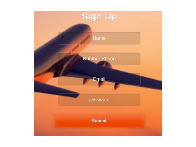
![Sign up form [Validations NOT ACHIEVED]](http://d2d3qesrx8xj6s.cloudfront.net/img/screenshots/085267fd2b785be54d5d05937defdd27ccc633ab.jpg)