"Transparent Sticky NavBar"
Bootstrap 4.1.1 Snippet by erickkf600

<link href="//maxcdn.bootstrapcdn.com/bootstrap/4.1.1/css/bootstrap.min.css" rel="stylesheet" id="bootstrap-css"> <script src="//maxcdn.bootstrapcdn.com/bootstrap/4.1.1/js/bootstrap.min.js"></script> <script src="//cdnjs.cloudflare.com/ajax/libs/jquery/3.2.1/jquery.min.js"></script> <!------ Include the above in your HEAD tag ----------> <!DOCTYPE html> <html lang="pt-br"> <head> <meta charset="UTF-8"> <meta name="viewport" content="width=device-width, initial-scale=1.0"> <meta http-equiv="X-UA-Compatible" content="ie=edge"> <title>Responsive Sticky Navbar</title> <link rel="stylesheet" href="style.css"> <link rel="stylesheet" href="https://maxcdn.bootstrapcdn.com/font-awesome/4.7.0/css/font-awesome.min.css"> <script src="https://code.jquery.com/jquery-3.3.1.js"></script> </head> <body> <div class="wrapper"> <header> <nav> <div class="menu-icon"> <i class="fa fa-bars fa-2x"></i> </div> <div class="logo"> LOGO </div> <div class="menu"> <ul> <li><a href="#">Home</a></li> <li><a href="#">About</a></li> <li><a href="#">Blog</a></li> <li><a href="#">Contact</a></li> <li><a href="#">Contact</a></li> <li><a href="#">Contact</a></li> </ul> </div> </nav> </header> <div class="content"> <p> Lorem Ipsum is simply dummy text of the printing and typesetting industry. Lorem Ipsum has been the industry's standard dummy text ever since the 1500s, when an unknown printer took a galley of type and scrambled it to make a type specimen book. It has survived not only five centuries, but also the leap into electronic typesetting, remaining essentially unchanged. It was popularised in the 1960s with the release of Letraset sheets containing Lorem Ipsum passages, and more recently with desktop publishing software like Aldus PageMaker including versions of Lorem Ipsum. </p> <p> Lorem Ipsum is simply dummy text of the printing and typesetting industry. Lorem Ipsum has been the industry's standard dummy text ever since the 1500s, when an unknown printer took a galley of type and scrambled it to make a type specimen book. It has survived not only five centuries, but also the leap into electronic typesetting, remaining essentially unchanged. It was popularised in the 1960s with the release of Letraset sheets containing Lorem Ipsum passages, and more recently with desktop publishing software like Aldus PageMaker including versions of Lorem Ipsum. </p> </div> </div> </body> </html>
html, body { margin: 0; padding: 0; width: 100%; } body { font-family: "Helvetica Neue",sans-serif; font-weight: lighter; } header { width: 100%; height: 100vh; background: url(https://wallpaper.wiki/wp-content/uploads/2017/05/wallpaper.wiki-Beautiful-Full-HD-Wallpaper-Download-Free-PIC-WPE0010098.jpg) no-repeat 50% 50%; background-size: cover; } .content { width: 94%; margin: 4em auto; font-size: 20px; line-height: 30px; text-align: justify; } .logo { line-height: 60px; position: fixed; float: left; margin: 16px 46px; color: #fff; font-weight: bold; font-size: 20px; letter-spacing: 2px; } nav { position: fixed; width: 100%; line-height: 60px; } nav ul { line-height: 60px; list-style: none; background: rgba(0, 0, 0, 0); overflow: hidden; color: #fff; padding: 0; text-align: right; margin: 0; padding-right: 40px; transition: 1s; } nav.black ul { background: #000; } nav ul li { display: inline-block; padding: 16px 40px;; } nav ul li a { text-decoration: none; color: #fff; font-size: 16px; } .menu-icon { line-height: 60px; width: 100%; background: #000; text-align: right; box-sizing: border-box; padding: 15px 24px; cursor: pointer; color: #fff; display: none; } @media(max-width: 786px) { .logo { position: fixed; top: 0; margin-top: 16px; } nav ul { max-height: 0px; background: #000; } nav.black ul { background: #000; } .showing { max-height: 34em; } nav ul li { box-sizing: border-box; width: 100%; padding: 24px; text-align: center; } .menu-icon { display: block; } }
$(document).ready(function() { $(".menu-icon").on("click", function() { $("nav ul").toggleClass("showing"); }); }); // Scrolling Effect $(window).on("scroll", function() { if($(window).scrollTop()) { $('nav').addClass('black'); } else { $('nav').removeClass('black'); } })

Related: See More


Questions / Comments:

Hi,

when I implement it like that and I am scrolling up, the part

if($(window).scrollTop()) {

$('nav').addClass('black');

}

is triggered again and the second part

else {

$('nav').removeClass('black');

}

is executed a few seconds later and not instantly.

Is there any way to fix it?

BélaN (1) - 4 years ago - Reply 1


if($(window).scrollTop() >150 ) {

$('nav').addClass('black');

}

hqkqn (0) - 4 years ago - Reply 0


how can I use this code on the WordPress website

112abdulraheem () - 3 years ago - Reply 0


how can I use this code on the WordPress website

112abdulraheem () - 3 years ago - Reply 0


Thank you for this code, i will be using this for my website.

:)

Doubtingeye352 () - 3 years ago - Reply 0


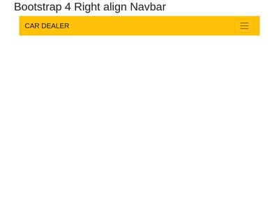
Hi..can someone tell me how to load the logo file at top-left side where logo is mentioned?

iamraj8191 () - 3 years ago - Reply 0


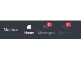
Hi..can anyone help me from how to get out menu toggle disappear after selecting a link from it...After selecting a link it is not shrinking...Thank you

sivasuriya () - 4 years ago - Reply 0


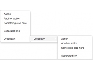
This is a great design, but is there a way of incorporating dropdown elements into the menu? I can't seem to make this work...

joeflaherty () - 4 years ago - Reply 0


how can you change color on the links when hovering over them?

eirvav () - 4 years ago - Reply 0


nav ul li a:hover{

color: #...

}

erickkf600 () - 4 years ago - Reply 0