Free Template
Argon Dashboard
51.7K 33
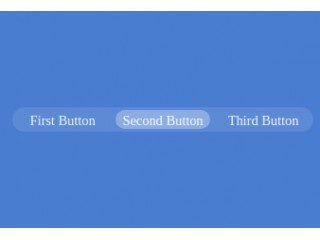
Animated Radio tab
282.8K 159
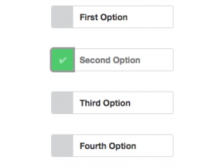
Funky Radio/Checkbox Buttons V2.0
203.3K 142
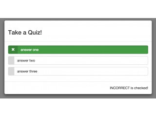
Modal Quiz with Radio button
- Now