Free Template
Light Bootstrap Dashboard React
94.9K 13
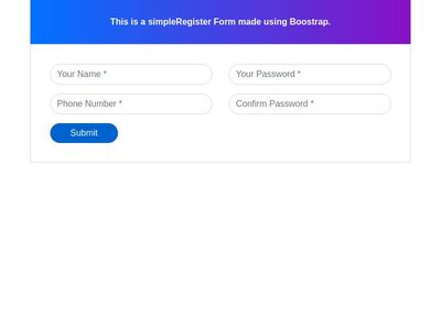
Bootstrap 4 Simple Registration Form
444.5K 265
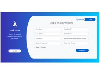
Bootstrap Dual Design Registration Form
221.4K 155
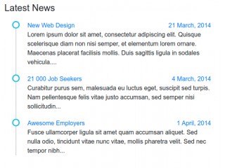
Simple Vertical timeline
- Now