Free Template
Datepicker
133.4K 30
Navbar with Social icon & Dropdown
256.9K 83
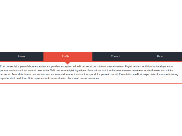
Tabs style 1
223.1K 48
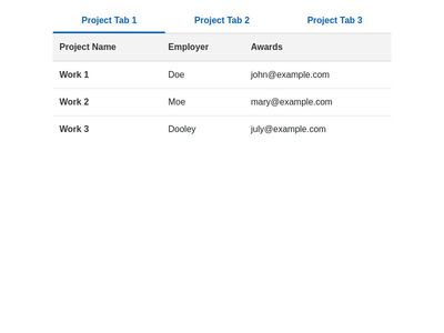
Bootstrap Tabs with Table
- Now