"Fixed Header Scrolling Table"
Bootstrap 3.3.0 Snippet by Sentencia

<link href="//maxcdn.bootstrapcdn.com/bootstrap/3.3.0/css/bootstrap.min.css" rel="stylesheet" id="bootstrap-css"> <script src="//maxcdn.bootstrapcdn.com/bootstrap/3.3.0/js/bootstrap.min.js"></script> <script src="//cdnjs.cloudflare.com/ajax/libs/jquery/3.2.1/jquery.min.js"></script> <!------ Include the above in your HEAD tag ----------> <div class="container"> <div class="row"> <div class="panel panel-default"> <div class="panel-heading"> <h4> Fixed Header Scrolling Table </h4> </div> <table class="table table-fixed"> <thead> <tr> <th class="col-xs-2">#</th><th class="col-xs-8">Name</th><th class="col-xs-2">Points</th> </tr> </thead> <tbody> <tr> <td class="col-xs-2">1</td><td class="col-xs-8">Mike Adams</td><td class="col-xs-2">23</td> </tr> <tr> <td class="col-xs-2">2</td><td class="col-xs-8">Holly Galivan</td><td class="col-xs-2">44</td> </tr> <tr> <td class="col-xs-2">3</td><td class="col-xs-8">Mary Shea</td><td class="col-xs-2">86</td> </tr> <tr> <td class="col-xs-2">4</td><td class="col-xs-8">Jim Adams</td><td>23</td> </tr> <tr> <td class="col-xs-2">5</td><td class="col-xs-8">Henry Galivan</td><td class="col-xs-2">44</td> </tr> <tr> <td class="col-xs-2">6</td><td class="col-xs-8">Bob Shea</td><td class="col-xs-2">26</td> </tr> <tr> <td class="col-xs-2">7</td><td class="col-xs-8">Andy Parks</td><td class="col-xs-2">56</td> </tr> <tr> <td class="col-xs-2">8</td><td class="col-xs-8">Bob Skelly</td><td class="col-xs-2">96</td> </tr> <tr> <td class="col-xs-2">9</td><td class="col-xs-8">William Defoe</td><td class="col-xs-2">13</td> </tr> <tr> <td class="col-xs-2">10</td><td class="col-xs-8">Will Tripp</td><td class="col-xs-2">16</td> </tr> <tr> <td class="col-xs-2">11</td><td class="col-xs-8">Bill Champion</td><td class="col-xs-2">44</td> </tr> <tr> <td class="col-xs-2">12</td><td class="col-xs-8">Lastly Jane</td><td class="col-xs-2">6</td> </tr> </tbody> </table> </div> </div> </div>
.table-fixed thead { width: 97%; } .table-fixed tbody { height: 230px; overflow-y: auto; width: 100%; } .table-fixed thead, .table-fixed tbody, .table-fixed tr, .table-fixed td, .table-fixed th { display: block; } .table-fixed tbody td, .table-fixed thead > tr> th { float: left; border-bottom-width: 0; }

Related: See More


Questions / Comments:

it doesn't work please help me, please kill me end my life

willycuba () - 4 years ago - Reply 0


thanks dude :*

adhiprayoga () - 6 years ago - Reply 0


https://bootsnipp.com/snippets/lV892

banwarilalpurvya (0) - 5 years ago - Reply 0


This wont work with my code because I'm using bootsrap responsive table which has more than 40 columns and it is not working on fixed header, I unable to find this thing so please help me to create something like that, and that columns will be managed as per its content

sagar vispute () - 7 years ago - Reply 0


Hi Did you get any solution, i am also looking for same

Mahesh Babu Bokkisam () - 6 years ago - Reply 0


Thanks for this snippet.

Jamiel Sharief () - 7 years ago - Reply 0


Thank you for this! I looked around for quite a while before finding this solution. It was the only one that worked for me.

Snouto () - 7 years ago - Reply 0


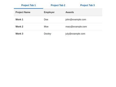
It seems to me that if the content in the Name column is very long, the style is messed up.

LG Optimusv () - 7 years ago - Reply 0


Try the following and see if it helps:
.table-fixed tbody td, .table-fixed thead > tr> th {
display: inline-block;
border-bottom-width: 0;
}

Aravind () - 6 years ago - Reply 0


Full CSS:
.table-fixed thead {
width: 97%;
}
.table-fixed tbody {
height: 230px;
overflow-x: auto;
overflow-y: auto;
width: 99%;
}
.table-fixed thead, .table-fixed tbody, .table-fixed tr, .table-fixed td, .table-fixed th {
display: block;
}
.table-fixed tbody td, .table-fixed thead > tr> th {
display: inline-block;
border-bottom-width: 0;
}

Aravind () - 6 years ago - Reply 0