Free Template
Awesome Landing Page
273.5K 135
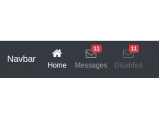
Bootstrap 4 Navbar with Icon Top
65.2K 96
Hamburger Icon Animations
133.1K 30
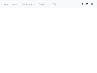
Navbar with Social icon & Dropdown
- Now