Free Template
Now UI Dashboard
720.2K 651
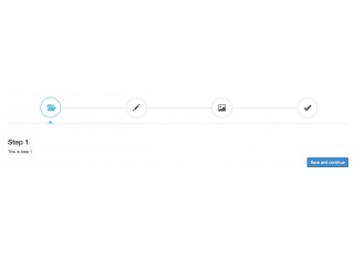
Form wizard (using tabs)
186.8K 288
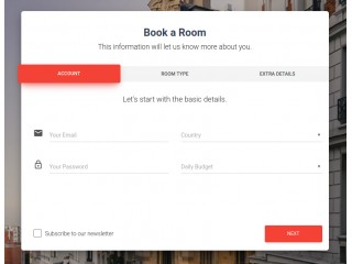
Bootstrap Material Wizard
367.3K 358
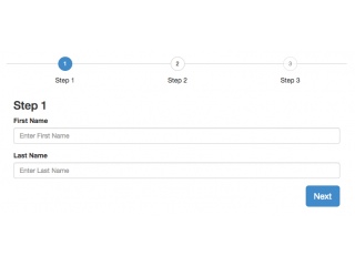
Form Wizard and validation
- Now