Free Template
Vuetify Material Dashboard
92.0K 58
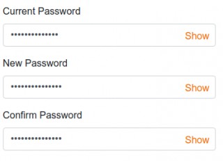
Creating password field text hide show via a single class
51.0K 20
Lazy Loading Images with placeholders
122.9K 100
Bootstrap Images to Left and Right with Text and Heading
- Now