Free Template
Get Shit Done Kit
357.2K 289
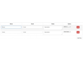
Dynamic Sortable Tables
223.1K 48
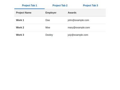
Bootstrap Tabs with Table
78.2K 115
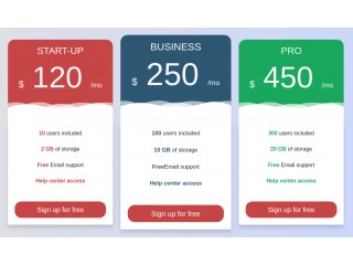
Creative Princing Table
- Now