Template
Vue Black Dashboard Pro
95.5K 76
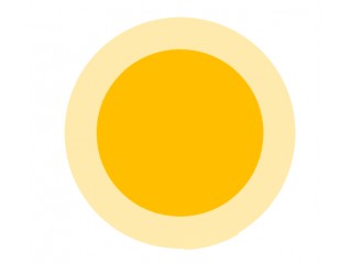
Sonar Wave Effect in Circle With CSS
267.4K 346
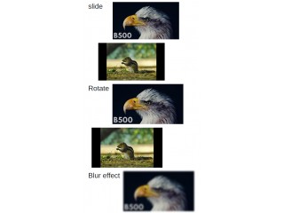
Hover Effect Style
51.3K 40
Different types of hover and transition effect.
- Now