"Pinterest-like Responsive Grid"
Bootstrap 3.3.0 Snippet by mrmccormack

<link href="//maxcdn.bootstrapcdn.com/bootstrap/3.3.0/css/bootstrap.min.css" rel="stylesheet" id="bootstrap-css"> <script src="//maxcdn.bootstrapcdn.com/bootstrap/3.3.0/js/bootstrap.min.js"></script> <script src="//code.jquery.com/jquery-1.11.1.min.js"></script> <!------ Include the above in your HEAD tag ----------> <div class="container"> <div class="row"> <h2>Pinterest Responsive Grid</h2> <p>Best viewed <a href="http://bootsnipp.com/iframe/Zkk0O" target="_blank">full screen</a> </p> <hr> <section id="pinBoot"> <article class="white-panel"><img src="http://i.imgur.com/sDLIAZD.png" alt=""> <h4><a href="#">Title 1</a></h4> <p>Lorem ipsum dolor sit amet, consectetur adipisicing elit, sed do eiusmod tempor incididunt ut labore et dolore magna aliqua. Ut enim ad minim veniam, quis nostrud exercitation ullamco laboris nisi ut aliquip ex ea commodo consequat. Duis aute irure dolor in reprehenderit in voluptate velit esse cillum dolore eu fugiat nulla pariatur. Excepteur sint occaecat cupidatat non proident, sunt in culpa qui officia deserunt mollit anim id est laborum.</p> </article> <article class="white-panel"> <img src="http://i.imgur.com/8lhFhc1.gif" alt=""> <h4><a href="#">Title 2</a></h4> <p>Excepteur sint occaecat cupidatat non proident, sunt in culpa qui officia deserunt mollit anim id est laborum.</p> </article> <article class="white-panel"> <img src="http://i.imgur.com/xOIMvAe.jpg" alt=""> <h4><a href="#">Title 3</a></h4> <p>Lorem ipsum dolor sit amet, consectetur adipisicing elit, sed do eiusmod tempor incididunt ut labore et dolore magna aliqua. Ut enim ad minim veniam, quis nostrud exercitation ullamco laboris nisi ut aliquip ex ea commodo consequat. Duis aute irure dolor in reprehenderit in voluptate velit esse cillum dolore eu fugiat nulla pariatur.</p> </article> <article class="white-panel"> <img src="http://i.imgur.com/3gXW3L3.jpg" alt=""> <h4><a href="#">Title 4</a></h4> <p>Lorem ipsum dolor sit amet, consectetur adipisicing elit, sed do eiusmod tempor incididunt ut labore et dolore magna aliqua. Ut enim ad minim veniam, quis nostrud exercitation ullamco laboris nisi ut aliquip ex ea commodo consequat. Duis aute irure dolor in reprehenderit in voluptate velit esse cillum dolore eu fugiat nulla pariatur. Excepteur sint occaecat cupidatat non proident, sunt in culpa qui officia deserunt mollit anim id est laborum.</p> </article> <article class="white-panel"> <img src="http://i.imgur.com/o2RVMqm.jpg" alt=""> <h4><a href="#">Title 5</a></h4> <p>Duis aute irure dolor in reprehenderit in voluptate velit esse cillum dolore eu fugiat nulla pariatur. Excepteur sint occaecat cupidatat non proident, sunt in culpa qui officia deserunt mollit anim id est laborum.</p> </article> <article class="white-panel"> <img src="http://i.imgur.com/kFFpuKA.jpg" alt=""> <h4><a href="#">Title 6</a></h4> <p>Lorem ipsum dolor sit amet, consectetur adipisicing elit, sed do eiusmod tempor incididunt ut labore et dolore magna aliqua. Ut enim ad minim veniam, quis nostrud exercitation ullamco laboris nisi ut aliquip ex ea commodo consequat. Duis aute irure dolor in reprehenderit in voluptate velit esse cillum dolore eu fugiat nulla pariatur.</p> </article> <article class="white-panel"><img src="http://i.imgur.com/E9RmLPA.jpg" alt=""> <h4><a href="#">Title 7</a></h4> <p>Lorem ipsum dolor sit amet, consectetur adipisicing elit, sed do eiusmod tempor incididunt ut labore et dolore magna aliqua. Ut enim ad minim veniam, quis nostrud exercitation ullamco laboris nisi ut aliquip ex ea commodo consequat. Duis aute irure dolor in reprehenderit in voluptate velit esse cillum dolore eu fugiat nulla pariatur. Excepteur sint occaecat cupidatat non proident, sunt in culpa qui officia deserunt mollit anim id est laborum.</p> </article> <article class="white-panel"> <img src="http://i.imgur.com/8lhFhc1.gif" alt=""> <h4><a href="#">Title 8</a></h4> <p>Excepteur sint occaecat cupidatat non proident, sunt in culpa qui officia deserunt mollit anim id est laborum.</p> </article> </section> <hr> </div> <p> <a href="http://validator.w3.org/check?uri=http%3A%2F%2Fbootsnipp.com%2Fiframe%2FZkk0O" target="_blank"><small>HTML</small><sup>5</sup></a> <br> <br> </p> </div>
/* Ref: Thanks to: http://www.jqueryscript.net/layout/Simple-jQuery-Plugin-To-Create-Pinterest-Style-Grid-Layout-Pinterest-Grid.html */ body { background-color:#eee; } #pinBoot { position: relative; max-width: 100%; width: 100%; } img { width: 100%; max-width: 100%; height: auto; } .white-panel { position: absolute; background: white; box-shadow: 0px 1px 2px rgba(0, 0, 0, 0.3); padding: 10px; } /* stylize any heading tags withing white-panel below */ .white-panel h1 { font-size: 1em; } .white-panel h1 a { color: #A92733; } .white-panel:hover { box-shadow: 1px 1px 10px rgba(0, 0, 0, 0.5); margin-top: -5px; -webkit-transition: all 0.3s ease-in-out; -moz-transition: all 0.3s ease-in-out; -o-transition: all 0.3s ease-in-out; transition: all 0.3s ease-in-out; }
$(document).ready(function() { $('#pinBoot').pinterest_grid({ no_columns: 4, padding_x: 10, padding_y: 10, margin_bottom: 50, single_column_breakpoint: 700 }); }); /* Ref: Thanks to: http://www.jqueryscript.net/layout/Simple-jQuery-Plugin-To-Create-Pinterest-Style-Grid-Layout-Pinterest-Grid.html */ /* Pinterest Grid Plugin Copyright 2014 Mediademons @author smm 16/04/2014 usage: $(document).ready(function() { $('#blog-landing').pinterest_grid({ no_columns: 4 }); }); */ ;(function ($, window, document, undefined) { var pluginName = 'pinterest_grid', defaults = { padding_x: 10, padding_y: 10, no_columns: 3, margin_bottom: 50, single_column_breakpoint: 700 }, columns, $article, article_width; function Plugin(element, options) { this.element = element; this.options = $.extend({}, defaults, options) ; this._defaults = defaults; this._name = pluginName; this.init(); } Plugin.prototype.init = function () { var self = this, resize_finish; $(window).resize(function() { clearTimeout(resize_finish); resize_finish = setTimeout( function () { self.make_layout_change(self); }, 11); }); self.make_layout_change(self); setTimeout(function() { $(window).resize(); }, 500); }; Plugin.prototype.calculate = function (single_column_mode) { var self = this, tallest = 0, row = 0, $container = $(this.element), container_width = $container.width(); $article = $(this.element).children(); if(single_column_mode === true) { article_width = $container.width() - self.options.padding_x; } else { article_width = ($container.width() - self.options.padding_x * self.options.no_columns) / self.options.no_columns; } $article.each(function() { $(this).css('width', article_width); }); columns = self.options.no_columns; $article.each(function(index) { var current_column, left_out = 0, top = 0, $this = $(this), prevAll = $this.prevAll(), tallest = 0; if(single_column_mode === false) { current_column = (index % columns); } else { current_column = 0; } for(var t = 0; t < columns; t++) { $this.removeClass('c'+t); } if(index % columns === 0) { row++; } $this.addClass('c' + current_column); $this.addClass('r' + row); prevAll.each(function(index) { if($(this).hasClass('c' + current_column)) { top += $(this).outerHeight() + self.options.padding_y; } }); if(single_column_mode === true) { left_out = 0; } else { left_out = (index % columns) * (article_width + self.options.padding_x); } $this.css({ 'left': left_out, 'top' : top }); }); this.tallest($container); $(window).resize(); }; Plugin.prototype.tallest = function (_container) { var column_heights = [], largest = 0; for(var z = 0; z < columns; z++) { var temp_height = 0; _container.find('.c'+z).each(function() { temp_height += $(this).outerHeight(); }); column_heights[z] = temp_height; } largest = Math.max.apply(Math, column_heights); _container.css('height', largest + (this.options.padding_y + this.options.margin_bottom)); }; Plugin.prototype.make_layout_change = function (_self) { if($(window).width() < _self.options.single_column_breakpoint) { _self.calculate(true); } else { _self.calculate(false); } }; $.fn[pluginName] = function (options) { return this.each(function () { if (!$.data(this, 'plugin_' + pluginName)) { $.data(this, 'plugin_' + pluginName, new Plugin(this, options)); } }); } })(jQuery, window, document);

Related: See More


Questions / Comments:

Hey Thanks for sharing awesome snippets, i have used this is in my website https://kalarikendramdelhi.com/, please check its awesome looking

webenlance () - 5 years ago - Reply 0


Hey, anyone has experienced contents overlapping on load? If so, how did you fix this?

Joana Martins () - 6 years ago - Reply 0


How to change full width in mobile responsive?

Iqbar Alhakim () - 7 years ago - Reply 0


Thank youuu!!, works fine for me. I just need to add read more button. Can somebody please tell how do I go about it??

Stephen Br () - 7 years ago - Reply 0


I have tried adding dynamic article to the list . load more images in that time overlap the section . anybody can help for me

thabsheer () - 7 years ago - Reply 0


Definitely like ... nice work :)

DK () - 7 years ago - Reply 0


Hello, I an a novice compared to other designers but I am trying to learn. I really like this script and have downloaded it. I used the template to create my own working layout but when I try to implement it into my design it stalls. I believe that there might be a conflict with the version of bootstrap that I am using or that I have a javascript conflict. I have commented out all other javascript files to see if that will remedy the problem with no success. Which leaves me to believe that it has to do with the core bootstrap.css version that I am working with. I am using a free template to learn on and it uses bootstrap v2.1.1 and this script uses v3.1.1. Am I on the right path in trying to troubleshoot my problem?

Michelle Ricketts () - 7 years ago - Reply 0


I did figure out what my problem was. It was a javascript conflict. This script does work in BS2 but as previously mentioned, the columns overlap in my container. Now I just need to figure out how to resize the columns to fit my space. I believe this is a javascript issue in the pinterest_grid.js file. I'm not sure I can fix it with css. Any suggestions?

Michelle Ricketts () - 7 years ago - Reply 0


Why did you fix this problem so slowly.?

Cuma Soyak () - 6 years ago - Reply 0


I have tried adding dynamic article to the list - seems does't work properly - overlaps the section ! Anyone tried dynamically adding article to the section ?

Arif () - 8 years ago - Reply 0


Hi Guys,
I want to break the grid on i-pad in two columns and on i-phone in one column. Does anyone have an idea how it is possible?

yogesh () - 8 years ago - Reply 0


Add:
double_column_breakpoint: 640,

//Make two cols
Plugin.prototype.calculate_two_cols = function (double_column_mode) {
var self = this,
tallest = 0,
row = 0,
$container = $(this.element),
container_width = $container.width();
$article = $(this.element).children();

if(double_column_mode === true) {
article_width = $container.width() - self.options.padding_x;
} else {
article_width = ($container.width() - self.options.padding_x * self.options.double_columns) / self.options.double_columns;
}

$article.each(function() {
$(this).css('width', article_width);
});

columns = self.options.double_columns;

$article.each(function(index) {
var current_column,
left_out = 0,
top = 0,
$this = $(this),
prevAll = $this.prevAll(),
tallest = 0;

if(double_column_mode === false) {
current_column = (index % columns);
} else {
current_column = 0;
}

for(var t = 0; t < columns; t++) {
$this.removeClass('c'+t);
}

if(index % columns === 0) {
row++;
}

$this.addClass('c' + current_column);
$this.addClass('r' + row);

prevAll.each(function(index) {
if($(this).hasClass('c' + current_column)) {
top += $(this).outerHeight() + self.options.padding_y;
}
});

if(double_column_mode === true) {
left_out = 0;
} else {
left_out = (index % columns) * (article_width + self.options.padding_x);
}

$this.css({
'left': left_out,
'top' : top
});
});

this.tallest($container);
$(window).resize();
};

//Replace make_layout_change function

Plugin.prototype.make_layout_change = function (_self) {

if($(window).width() > _self.options.single_column_breakpoint && $(window).width() < _self.options.double_column_breakpoint) {
_self.calculate_two_cols(false);
} else if($(window).width() > _self.options.single_column_breakpoint) {

_self.calculate(false);
} else {
_self.calculate_two_cols(true);
}

};

Shekhar Raut () - 7 years ago - Reply 0


This solution doesn't work for me. Grid goes crazy at the .double_column_breakpoint...
Some one tried?

maxim usik () - 6 years ago - Reply 0


hello, really nice! It was working until i have it on wordpress..
it does note make the grid.. any special call? tks.

Chefs4Fun () - 8 years ago - Reply 0


Thank you!!!!!! what a nice grid!!

Quique Flowers () - 8 years ago - Reply 0


What if I want the panels to resize according to the width of the image?

Vale Ar () - 8 years ago - Reply 0


thanks a lot, but how to make it 3 columns?

Abdullah T. Aqrabawi () - 8 years ago - Reply 0


If i resize browser down to min, the margin/padding is off. Left has 0 and right looks like about 15px.

Simonbook () - 8 years ago - Reply 0


Hi guys, I really liked this plugin and I think that I fixed it. The problem was in the "for" loop. On line 108 just changed $this.removeClass('c'+t); to $this.removeClass('c'); . It works fine for me with no errors.

GopchiArnaudov () - 8 years ago - Reply 0


Why did you fix this problem so slowly?

Cuma Soyak () - 6 years ago - Reply 0


thank you very much, it worked!

Edgars Koronevskis () - 8 years ago - Reply 0


thanks gopchi! worked for me

Anna Isabel () - 8 years ago - Reply 0


Ä° want to add 2 of these in my page but it doesnt fit properly

aaa () - 8 years ago - Reply 0


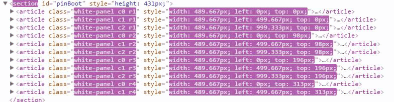
I've spotted that the class of the section is blinking always. I can see styles are added all the time. What is this for?

GeorgiMarokov () - 8 years ago - Reply 0


Try to do this -> On line 108 just change $this.removeClass('c'+t); to $this.removeClass('c'); . It works fine for me with no errors.

GopchiArnaudov () - 8 years ago - Reply 0


Same problem and $this.removeClass('c'); dont work with AJAX.
https://i.gyazo.com/3b1685b...

Antonio Romeo Riga () - 8 years ago - Reply 0


True, maybe @mrmccormack would be able to take a look and fix the CPU overload :)

maxsurguy () - 8 years ago - Reply 0


Be careful! This plugin is too much load cpu.

Кирилл () - 8 years ago - Reply 0


Could you elaborate on how one could reduce the load? Really great work.

Gottlieb () - 8 years ago - Reply 0


get rid of hover and shadows effects the boxes those are the biggest CPU and GPU hogs, performance has increased 45%

NorthScope () - 7 years ago - Reply 0


Any ideas why this is not laying out correctly in Bootstrap 2.3.2? It seems that the image widths are not calculating properly. I realize that you did this for BS 3, but I have had great success working with V3 code in V2 with a little tweeking.

Flowers by the Sea () - 9 years ago - Reply 0